Thu 23 Aug 2012
The time frame of knitting design resembles no other in my life, except perhaps the building of long-term science research career. It is a long, slow process, and years often slip by between the time I see a yarn and the time that I am actually ready to buy and knit with it, or between the time that a design first enters my head and the time that it gets cast on.
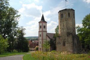
I can put a specific date on the time when today’s theoretical knitting project first came to my mind. It was almost three years ago now, in Germany. We’d headed out to the tiny town of Gondelsheim, just a few train stops away from the town where we were living. There was an old castle there that we’d seen from the train, and we decided to go there for the photo shoot of the waving lace stole.
Like so many places in Germany, walking up to the castle was like walking through the scenes of a story book. Can’t you just hear the horse’s hooves and the trumpets of a royal precession coming around the corner?
The castle was beautiful, and had a wonderful wildflower garden where we spent several happy hours snapping pictures that will probably become colorways one day. Around the back, there was a walled-in courtyard, full of all the exquisite architectural detail that makes old European buildings true art.
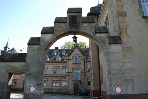
(I also love how this extremely old castle has two extremely modern traffic signs on either side of the gate.)
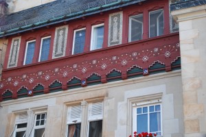
From inside the courtyard, we could see even more of those wonderful details. This one in particular caught my eye.
I knew as soon as I saw it that that needed to become a colorwork sweater. There are too many colors for a traditional fairisle motif, but I just loved the symmetry of the design. Wouldn’t it make a beautiful edging?
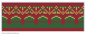
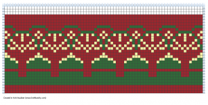
So now, three years later, I find myself sitting down to finally translate that photo into knitwear. I started out with quite a literal translation, except that I let those yellow triangles run together to make a zigzag along the bottom edge.
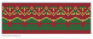
Next, I tried breaking them up a bit to stay more true to the original design. I think I like this better, anyway. This looks a little more like rounded castle crenellations to me.
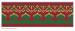
Then I added just one extra stitch per repeat to make them a little bit pointier. I’m not sure which of these I like better, but I’m sticking with the pointy ones for now.
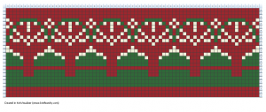
The contrast seemed a little bit low, but I wasn’t sure if that was the thickness of my design, or just the colors I’d chosen, so I decided to play a bit with that. After looking more closely at the photo, I realized that the details weren’t really gold at all, but more of an off-white color. So I tried that:
That was a little too bright for my taste, so I settled for something in between; kind of a yellow beige to match the wall below the design.
I like that one quite a lot, and I think it would show up much better than the darker gold. I also added in a series of scallops at the top edge on that revision; it’s similar to the lines in the architecture, and I thought it would be nice to have a touch more green before switching to solid red.
Then I went back and made one little tweak. I deleted one row of colorwork, making the second set of scallops a little less pronounced.
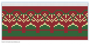
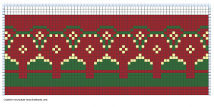
Then I decided to try just one more thing. I went back and deleted the sunburst lines. They’re not terribly pronounced in the architecture, and they do add a strong geometrical aspect to the motif, so I wanted to see what it would look like without.
I don’t like this one as well. It does a better job of emphasizing those central flowers, but it loses a lot of the motion and interest of the design. I’ll definitely stick with the sunbursts.
Overall, I am pretty happy with this design. It stays fairly true to the original, is interesting enough to be a focal piece, and is a small enough pattern that it could work for a delicate edging on a cardigan or sweater.
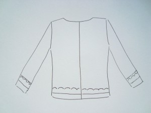
Next, I started thinking about what the sweater itself might look like. My first thought was something very simple; just a solid cardigan with an accent band at the hem and cuff.
I tend to be a pretty minimalist designer in most things, so simple is usually my preference when it comes to adding embellishments to a garment. This would be a nice, simple sweater with some pretty details; perfect for everyday wear. Still, I thought I’d play the edges a bit, just to see what happened.
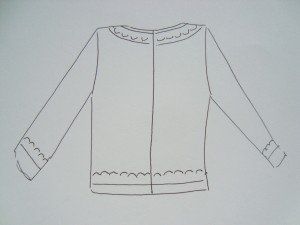
I’m not sure how I feel about a yoke neck. I don’t usually go for them, but if the pattern is small enough it could work here.
Or we could go all out and put edging all around.
This would turn into a somewhat more formal jacket, and I’d probably want a more tailored fit than I’ve drawn here, and I might also raise the hemline a bit for an almost-cropped feel. The front edge would look great with some decorative frog closures. I don’t think I’d use a button band or a zipper, though. Not sure why; this just feels like it would want the dressy look of a jacket. I do like how this design would really show off the colorwork edging, though I think I’d be more likely to wear the plain jane version above.
Of course, once you start drawing out sketches you need to consider the yarn you’re using. I’d go for a lightweight wool, I think. Something in the fingering weight range, probably 7-9 sts to the inch. Shetland would be nice; something with a little bit of a halo but not so much that you lose the stitch definition. The edging is 22 stitches deep, so I’d probably need to stay on the fine end of things to keep it compact.
And then there is color. I would definitely use something like the colors I have here for the edging. I love the rust and beige and green. My first plan was to have the body be rust-colored, but the more I look at the picture the more I think that a beige body with the colorwork edge might be really nice. (Since this is theoretical knitting, I can blatantly ignore the practical voice in my head that says I never wear beige, or anything light colored…). Depending on the colors available, I might even go for oatmeal, in a natural wool color, something with a little bit of heather to it.
I’d probably do the ribbing in green, even in the plain-Jane version. It would add some interest to the edges and tie in the colorwork a bit.
This sweater (in some form or another) is definitely on my knit-someday list. I think it would get a ton of use, and it would remind me of our time in Germany. Â I have no idea how long it will take me to get to it, but it will be fun to knit when I do.

Has it really been three years since you were in Germany? My, how time flies! I love the Germany pictures–they do have a storybook feel. And what a great inspiration for a colorwork design! I think this pattern will make a lovely sweater edging, whichever sweater style you choose to go with.
I immediately thought Bohus-inspired – more than 2 rows of colorwork, done in a sticky, haloed yarn so you could go with very long floats. What would the design do if you made some of those stitches into purls?
Thanks for sharing this process – it was fun!
I just love all your charts!! You must have a special knitting program software. Is a complete yoke top down with the design out of the question. Whatever you decide I know it will be lovely.
Love it. I actually find the jacket version quite nice (although I think I would do a zipper, for a sporty feel – also practical, around here). So much to think about! Wool would be lovely, or maybe an angora blend (a la Bohus)? Fun…
I like seeing your thought process through this. It makes me think how I would interpret the design. You definitely have me thinking.