Fri 10 Feb 2012
Insanity: Doing the same thing over and over again and expecting different results. Â ~Albert Einstein
After realizing that my latest “fix” has still not fixed the striped sweater, I finally sat down today to figure out what is really going on. I’ve been tweaking one thing after another, but clearly there’s something bigger going on that just isn’t working. Whenever I get to this point, it’s time to stop and reevaluate to see what I’m missing. Part of the problem is that I didn’t start this project expecting it to be a sweater, and so I hadn’t gone through all the design thinking that I’d usually do before casting on. So this afternoon, I sat down and looked at it very hard.
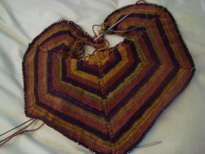
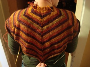
And I realized that it’s not a hexagon. It looks like a hexagon, doesn’t it?
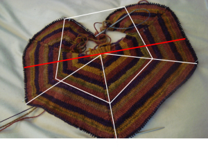
But it isn’t. Those angles are not 60 degrees. In fact, they’re much closer to 72 degrees, a fact which quickly explained all the problems I’ve been having.
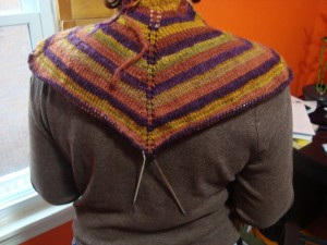
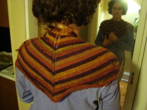
Instead of splitting my fabric right down the middle, the shoulder line I’m using puts 3/5 of the fabric in the back panel. I had used a different shoulder line in the first picture:
You can see that the first one has the increase line right along the top of the shoulder, but I’d moved it into a more traditional Raglan position in the later versions.
The Raglan line gave me a better fit on the neck, and would have been the perfect solution if I were working with a hexagon, since the stitches would have been evenly divided between front and back.
But I’m not working with a hexagon.
I’m going to have to pull back the latest fix anyway, but tonight I tried it on to check that changing the shoulder line is the right thing to do.
It is. The trouble is, moving the shoulder line puts all those extra stitches in the front, so now I need to figure out what to do with them there.
I’ll definitely have to cut a bunch of them out, but the question is: which ones?
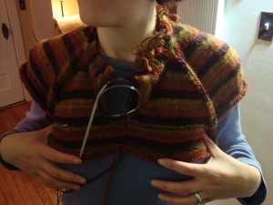
I can take some stitches out of the shoulder area to preserve the pentagon shape and make Raglan shaping in the front. This is very close to what I was expecting with the previous design. The Raglan is a pretty safe option; horizontal stripes aren’t my favorite thing ever, but it’s a classic design and I know I won’t feel too obtrusive wearing it.
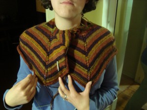
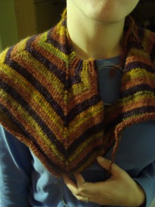
Or, I could take the stitches out of the front panel. I like the stripes going up over the shoulders in this one, but I’m not sure I like the front placket. Something in it feels very Pride and Prejudice to me (not that that’s a bad thing, but it’s not quite where I was expecting this design to go). Â Still, I think this one has the potential to grow on me.
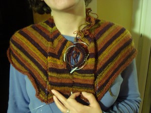
The last option is the one that has me most intrigued, but it also has the most potential to go wrong.
This is just another way of taking increases out of the front panel. I think the zig zag effect is interesting, but I’m not sure about adding two more “arrows” to this design in potentially attention-grabbing places. I’d continue the stripes down to mid-waist to match the back, which I think would reduce the arrow effect, but I really don’t know how I feel about this one. My first thought was that I absolutely didn’t like it (clown ruff, anyone?), the second thought was that maybe it wasn’t so bad, and now it’s kind of refusing to step aside.
I like the look of it better when the front is open, and it does do a good job of highlighting the geometry.
Branden is strongly in favor of the zig zags, followed by the front placket, leaving the Raglan in last place. Raglan is low on my list, too, except that I don’t have to worry about whether or not I’ll wear it. The other two are still fighting it out in my mind.
Thoughts?
How I love this whole process, I know I say that too often, but it’s true. I love that you blog about the “thinking it out” process, because it’s just so nifty.
Any who, I have to say that the design that has the most appeal to me is the last one, with the two arrows. I think it adds more complexity and intrigue to the design, but I understand how that means it also has potential to be more frustrating to figure out.
I think the diagonal stripes with the placket has potential also. What if you made the placket a different color? Maybe used the purple you are spinning for that? I think the placket would work better if it was a little quieter than the stripes of the rest of the top.
I think the raglan would work too, but would definitely be the less interesting of the options.
Thanks for explicating!
This post affirmed for me that I am decades, if not lifetimes, away from attempting to design my own sweater. Very impressive!
That last option (the zigzags?), definitely. Would you consider making it a cardigan? I think that would have the potential to create some nice lines down the front of the sweater in a way that shows off curves while being slimming at the same time (maybe offsetting the potential for horizontal stripes to not be slimming?)(of course, this is something that you don’t need to consider quite so much as some of the rest of us). After that, the placket. I agree that the raglan shaping doesn’t do as much as it could to show off the niftier features of this design.
I’m loving reading about your process – thank you for sharing it!
Zigzags – but with lapels.
The raglan does look nice to me, too.
I’d split my vote between zigzags and raglan (how decisive am I?). I would have sworn you were working with a hexagon, too. How our knits do deceive us!
Erica, I admire how you can not only think outside of the box, but you end up with several different options! Not too sure of the placket version, but as soon as you said P&P you had my attention. If you go with the zig zags just be careful where they end or you may be pointing to something else…