Tue 15 Feb 2011
We’ve been busy, busy behind the scenes setting up shop on Etsy. It takes more steps than you’d think to get everything sorted and ready to go. Branden has pioneered most of the shop setup for me, so I have only to show up and write the descriptions, but there has been a lot going on. Luckily, some of that also involves dyeing. Yarns are officially posted now, and we’ll soon be adding this weekend’s rovings to the mix.
I decided to play with semisolids this week. One of the things that I love the most about dyeing is watching all the endless variations that you can get from just a single color.
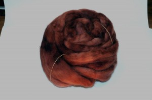
Chestnut brown, for example, becomes a beautiful shade of mahogany-bordering-on-rose. This is just one dye, with 4 different dilutions to really show off its variety.
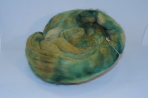
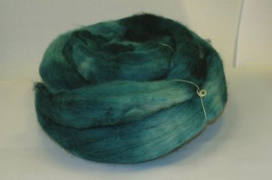
The green is a bit more complex; I mixed teal and pumpkin to get my colors, and then painted them on in varying strengths across the roving. Do you see all that depth?
I was really surprised how much the yellow came out in this one. Most of the dye was a 1:1 mixture in different dilutions, but I also threw in a little 3:1 (pumpkin to teal), and it really pops out at you.
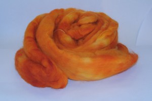
This one is quite possibly my favorite of the day, simply because it surprised me so much. I love the intensity of the pumpkin orange. Orange is not a color that I normally gravitate toward, but when I love it, I really love it.
This time I love it.
Of course, teal (and green) will always have a special place in my heart. These are my base colors, the ones that I live by. Accents are wonderful, but when I want a color that I know will work for me, these are where I turn.
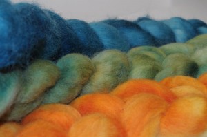
This color walks the line between blue and green, and it’s impossible to tell where exactly it falls. It was almost impossible to photograph, and only gets close to the actual color after some serious playing around with color levels in software. (The photo above is the same roving that was in the first picture and looked absolutely, undeniably blue. Go figure.)
Fortunately, Branden is a very patient man who doesn’t mind poking around with the camera for literally hours to get just the right color of yarn in a photo. Nor does he (apparently, at least) get sick of his wife, who is very, very picky about getting the color perfect, and then wants it posed prettily to boot.
We didn’t get around to taking photos before the sun went down, so all of these are “formal” shots taken in our little lightbox setup. I usually prefer to use “artsier” photos for the blog, but I’m afraid this week we’re going for documentarian. But the color is right, gosh darn it.*
There hasn’t been much knitting while we’ve been busy bustling around behind the scenes, but I’m hoping to get some in tonight, perhaps while I listen to an edition of On Point, which Branden called to tell me about tonight. They apparently mention Ellen’s Warm Hats not Heads campaign at about 15 minutes in, so it’s bound to be good. Off to listen and knit!
*At least until you go looking at it with a different monitor – then it goes all wonky again. The perfectionist in me cringes at the thought.
Ah, yes, the challenges of color and monitors. I did a little photo project in December. It required use of my brother’s computer (aka his graphic design software), and I was driven absolutely crazy by the fact the the picture on my screen looked different than on his screen and the print out was different still. It was nearly impossible to find an appropriate background color because I could never be sure which was ‘right.’ All this fancy technology, and they haven’t figured out colors….
Congratulations on the shop! I hope that goes well for you.
I’m really looking forward to listening to OnPoint myself – I just haven’t had a chance yet (although I downloaded the podcast onto my ipod). Soon, though!
The colors in those rovings are amazing!! I’m seriously impressed with the depths you’re getting in the “solids” – so very nice.
So many rovings, so little time. Please do get them up on the shop soon!