Sun 18 Sep 2011
A while ago, Linda sent me a series of photos, suggesting that they might make a good colorway.
Since I love purple (and pansies!), I was excited to give it a try. And so I sampled.
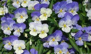
I ended up with a huge range of colors just from combining a few of my dyes in different ratios. And then, the trick was to choose the right colors to match the photos. This was my favorite of the photos she sent:
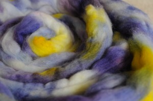
Look at all those cheery little faces! I particularly wanted to capture that bright spot of yellow in the center of the flowers. I also wanted to capture the gradual transition from blue to white. After much hemming and hawing over which purples were exactly right, I ended up with this fiber:
By keeping the color patches shorter than a staple length in most cases, the colors should blend as the fiber is spun, hopefully giving a gradient from pure purple all the way down to white. I left a lot more white on the fiber than I normally would, both to represent the white and blue flowers, and to give room to spin the yellow without mixing it too much with the purple. (In places where it does mix, I think it should give quite a nice green, judging from the couple of spots where the color touched on the fiber. You can see a tiny bit in the lower right corner of the photo.)
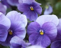
Next, I focused on these little beauties.
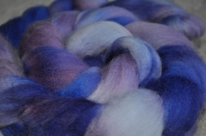
Here, I loved the little veins of dark blue running through a shaded purple. I started out with a purple base, and then added highlights of dark purple mixed with blue on top.
The dark “blue” here is really a violet blue. I took photos of these fibers once with my camera just after I dyed them, then Branden tried a few days later. At first, we blamed our lack of success on poor lighting (evening shots are never as good). Then, yesterday, Branden spent about two and a half hours taking photos of these four fibers before we got even close to color accuracy. Apparently purple is just hard to photograph. We have explored whole new frontiers in camera settings, and this is as close as we could get. So imagine that those dark blue regions are really a more intense version of the light purple (which did come out accurately), with a bit more blue added.
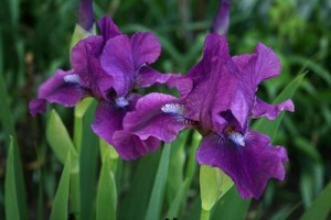
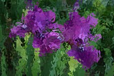
The next two rovings were even harder to photograph, but I think we did finally manage to get accurate colors on them. The first was actually supposed to be a colorway from this photo, which Linda processed in photoshop to help the colors stand out:
Aren’t they beautiful? I especially like the impressionist one; it really could be printed and hung on the wall.
Unfortunately, I got distracted while I was mixing the dyes for this color, and forgot to add blue to one of my dyes. Instead, I ended up adding red twice, which meant that I really didn’t get the purples I was going for.
You can see hints of the iris colors in there, where the dyes with the right mixture stayed unmixed, but this really wasn’t where I intended to go with this fiber.
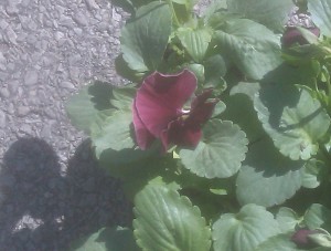
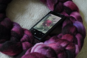
Sometimes the dye has a mind of its own, though, and in this case I was amused to discover how  little this “mistake” colorway had strayed from our theme. When we were at the farmers’ market yesterday morning, we saw this little guy:
Branden snapped a picture on his phone, and later we compared it to the not-iris colorway. As it turns out, it just wanted to be a maroon pansy instead.
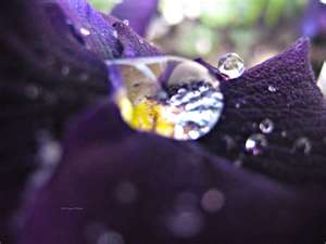
And finally, I made a deep, saturated colorway in purples and blacks, inspired by this photo:
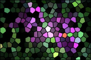
I made a mosaic here, too, to help me pick out the colors. Isn’t it amazing how many shades there are in that one photo?
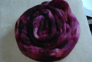
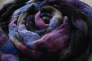
I didn’t have quite the right purple for this photo in my samples. I think the blue needs to be a little more subdued than the dyes that I have. So I added black to most of the purples, and then added some spots of pure black to deepen the color even more. I ended up with this:
It’s not an exact match, but I think it’s pretty close. Of all the colorways I dyed from these photos, I think this one is my favorite. I am working hard to resist the urge to claim it for myself.
So that’s my exploration of pansy purples. There are so many colors you could create from these photos that I think I’m likely to return to this colorway series someday. I’m especially interested to keep sampling in the purples region of the spectrum, because I picked up some navy blue dye at WI Sheep and Wool last weekend that I think it might just give me those shades that I’m missing in the black velvet sample. And really, I would wear any one of those colors, so more experimentation is probably in order.

Very nifty! You are making me wish I had more money to spend on roving and more time to spend on spinning!!
I think my favorite is the “accidental” pansy color–although normally I would tend more towards the blues. I agree that purple is just a difficult color to photograph. I wonder if it’s the reds in the purple–I always have trouble getting accurate reds, too. (Sometimes I try to fight with it in Photoshop, but that doesn’t always help, either.)
I had wondered if you’d made it to WI Sheep & Wool; I thought you had mentioned it.
Oh, gorgeous. I love me a good maroon, and for some reason they’re very hard to find. Beautiful!
Amazing! I particularly love the pansies colorway, and I can’t wait to see what happens if and when you try irises again – they’re all just gorgeous.
That first one is just absolutely my favorite pansy – and the roving really captures it nicely. The others are great, too, and indeed the accident captures those velvety maroons.
Very impressive job on the dying (even the too red iris, was a great match for the pansy). M favorite altered photo was the first iris, looks like a stained glass piece).