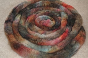
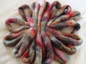
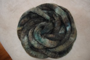
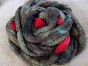
About a week ago, Ellen took a picture of a cardinal. And then, she asked me if I could dye spinning fiber that looks like it.
My dyeing skill is definitely not to that level, but I love a challenge, and what’s a challenge but the opportunity to try something you’re probably not ready for? (If you want to see a master of matching photo to fiber, check out Ruth’s blog over at Impulse of Delight. I want every yarn that she dyes.)
There are two main challenges in this project. The first, is contrast. It’s easy to make yarns with subtle variegation. You layer on a bunch of colors, and you gently smoosh (yes, that’s a technical term) the dye together to mix and blend it as much as you like. For contrast, it’s a different story. Dye goes onto fiber as solutions, not really any thicker than water. It’s easy to let two colors bleed into one another, but it is hard to keep them separate. You can buy gels and thickeners to help out, but I’ve never used them and don’t want to add another layer of complexity to the process right now.
So, contrast. Hard. That photo even has two kinds of contrast; there is the contrast between very dark and very light, and the contrast between grey/greens and bright red. This is fiber for spinning, so there’s also the additional blending (i.e. loss of contrast) that you’ll get at the wheel from spinning multi-colored fibers together.
Contrast is challenge #1 in terms of difficulty, but it falls second in the process, at the stage where the dye goes onto the fiber and then again when the fiber gets spun at the wheel.
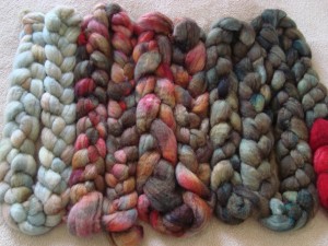
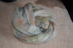
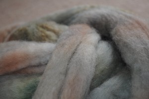
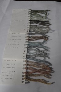
The first challenge is simply choosing which colors to use in the first place. I had the right greens right off, but the right grays just simply didn’t exist in my sample card collection. The gray in the photo is not a simple color; it’s a subtle mix of gray and blue in some regions, and gray and pink in others. Just diluting black wasn’t going to cut it, so I spent yesterday afternoon playing with all the different ways to add a hint of color to a pale, pale gray.

Predictably, I like the blue-grays and the green-grays the best, but I also got a pretty good range of pink-gray and even a couple of yellow-grays (though those are almost more like a pale mustardy brown, if you ask me.)
I usually prefer to use deep, saturated colors with a lot of intensity, but I am finding myself utterly charmed by these pale, pale colors. In their finest moments, the samples remind me a little bit of Blue Moon’s Spirit series, which I have always loved and will someday find an excuse to use. I never knit in white, but I love, love, love all those barely-there shades of color.
Even before Ellen asked her question about the cardinal, Branden and I had been discussing how to add a “suggestions” box to the website so that people can suggest color combinations and/or photos for me to play with when I’m dyeing. I don’t want to do custom orders (at least not as a general thing), because I don’t have and I just don’t want to have very precise control over my dyeing process. For me, a lot of the fun is in the magic of just seeing what happens, and I think that would get lost if I was focused on trying to match someone else’s vision. Or even my own vision, I suppose. I go to the dye studio with deliberately fuzzy expectations, and I’d like to keep it that way.
So the idea of custom “orders” is out, but I really enjoy working with combinations of color that I wouldn’t have put together on my own. I have a fairly limited personal palette, truth be told, and it’s really fun to step outside of it and dye something that I would never think to wear but that represents another person’s taste in my mind. I’ve dyed for friends four or five times, and I really enjoy the process of figuring out which colors will work for them, and putting them together in ways that surprise (and usually delight) me. Basically, I want the push outside of my box that custom dyeing would give, but without the pressure for me to get it perfect, or for the suggester to order if they don’t love what I come up with. Dyeing is always a gamble, and I never want someone feeling obligated to pay for something that doesn’t match their vision.
And that’s where the suggestion box comes in. People can suggest colors, combinations, general ideas (winter ocean, bali sunset…), or whatever else comes to mind, and I’ll put it on my list of ideas to play with someday. I might get to it immediately, I might get to it in a year. I might make a mess of it, or it might come out brilliantly. When the fiber/yarn is dyed, I’ll post it, and people can buy if they like it. If it’s not what they had in mind, it can find a home with someone else. I’ll get to play, and the shop gets filled with things that someone is likely to enjoy, and anyone who cares to read along will get to watch the journey.
The cardinal picture has been a really interesting pilot study for this idea. I’ve been thinking about it all week, plotting and planning ways to get the colors I want to work in the ways that I want them to work. It’s been a lot of fun so far, and it’s certainly opened up a whole new range of colors for me to explore, even if the final fiber isn’t what I hope it will be.
Thanks to Ellen for suggesting this current exploration, and for the rest of you, keep your eye out for a new suggestions form, once we figure out how on earth to make one that will do what I want. Surely there are some colors out there that you’d like to explore?
